Back to the on-screen lesson ·
Distinguish spatial association from a causal claim.
Paper packet. Every task here also exists on screen, where it is checked automatically; answers written on paper are not assessed by Nydus. When you are back at a device, enter your answers there.
Compare two spatial distributions, distinguish observation from mechanism, and choose evidence that separates competing explanations.
Recall how a rate differs from a count and how a map legend assigns values to areas. A spatial explanation begins with two comparable measurements, not with the visual resemblance of two color schemes. Keep track of whether a value refers to land, people, journeys or a reporting district. You will also use subtraction to compare changes and division to express a rate.
| Term | What it means |
|---|---|
| Association | A relationship between distributions without an established causal direction. |
| Confounder | A factor that helps produce both the proposed cause and outcome. |
| Mechanism | A process connecting a proposed cause to an outcome. |
| Counterfactual | What would have happened to the same unit without the intervention. |
Spatial association means that the distribution of one variable is related to the distribution of another. Neighborhoods with more tree canopy might also have lower afternoon surface temperatures. That observation is useful: it gives us a pattern to explain and a reason to investigate shade. It does not, by itself, show what would happen if we planted trees. Wealth, elevation, building materials, irrigation and distance from water might influence both variables. The difference between describing a pattern and identifying a mechanism is the central discipline of this lesson.
A geographic claim needs an observational unit. A neighborhood average is a statement about neighborhoods; a household survey describes sampled households; a satellite pixel describes an area sensed at a particular time. Moving between these units without new evidence creates an ecological inference error. A cooler neighborhood can still contain dangerously hot streets. Likewise, people experiencing the greatest exposure may travel outside their residential neighborhood. Throughout this lesson, all numerical places and records are invented instructional cases, not measurements of real communities.
Another way: table
| Block | Canopy (%) | Surface temperature (degrees Celsius) |
|---|---|---|
| Alder | 10 | 38 |
| Birch | 20 | 35 |
| Cedar | 30 | 34 |
| Dock | 40 | 31 |
Suppose a planner asks whether trees cool streets in Harbor District. Replace that broad question with an operational question: among the district's residential blocks, how does percent canopy relate to afternoon surface temperature on the same clear summer day? Canopy is the explanatory variable and temperature the response. Record the image date, pixel size and method used to summarize pixels within blocks. Aerial canopy observed in spring and temperature observed during a heatwave may not describe the same environmental state.
The map is a selected representation. Blocks with missing observations need a separate symbol, not a value of zero. Two legends with different class boundaries can produce similar patterns even when their numerical relationships differ. Make a paired table before interpreting the colors. Give every block one row and preserve the same identifier across the two datasets. An accidental join by a repeated street name can manufacture an apparent association.
Specify the population to which the question applies. Residential blocks exclude industrial land; including industrial land later changes the question. Record the exclusion and explain why it serves the investigation rather than hiding an inconvenient result.
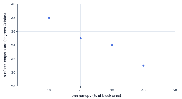
Consider four fictional blocks. Alder has 10 percent canopy and a surface temperature of 38 degrees Celsius; Birch has 20 and 35; Cedar has 30 and 34; Dock has 40 and 31. Higher canopy accompanies lower temperature in this small record. Comparing Alder and Dock gives 30 percentage points more canopy and 7 degrees lower temperature. The units differ, so do not subtract canopy from temperature or describe the difference as a percent reduction in heat.
A scatterplot places canopy on the horizontal axis and temperature on the vertical axis. Each point represents one block rather than a time in a sequence. The downward tendency supports a negative association. Connecting points as if the blocks were successive moments would imply an unsupported trajectory. Inspect exceptions before calculating a single summary: an exposed waterfront block or an irrigated sports field might reveal an omitted process.
A strong pattern across four selected blocks is not automatically representative of the whole district. Choose additional blocks across different elevations and building types. Explain whether selection was random, stratified by land use, or deliberately chosen to inspect contrasting cases. Each design supports a different scope of inference.
Draw the proposed mechanism in words: canopy creates shade, shade reduces incoming solar energy at a surface, and the surface heats less. This is a physically plausible process. Now construct a rival account: higher-income districts have both more trees and lighter roofs; roof reflectivity contributes to their lower observed temperatures. A third account might involve elevation or sea breezes. The purpose of alternatives is to discover what the present observations cannot separate.
Look for temporal order. If canopy was planted after the temperature measurement, it cannot explain that earlier temperature through shading. Check exposure: a tree on one side of a road may not shade the pavement measured at the observation time. Check the outcome: surface temperature is not identical to shaded air temperature or personal heat exposure. A study can answer its stated question correctly while being misused to support a different one.
Prediction makes an explanation testable. The shade account predicts a larger cooling difference between shaded and unshaded surfaces under strong sunlight than after sunset, other things equal. The elevation account predicts differences that persist even where canopy is comparable. A useful new measurement is one on which the rival accounts predict different results.
A before-and-after study strengthens the evidence only if other changes are considered. In a fictional intervention, treated blocks cool from 36 to 32 degrees while comparison blocks cool from 35 to 33. The treated change is minus 4 degrees; the comparison change is minus 2. Subtracting the comparison change gives an additional cooling of 2 degrees associated with the intervention. Reporting all 4 degrees as the treatment effect ignores the wider cooling.
This difference in changes is a descriptive contrast, not a guarantee of causality. It becomes more credible if both groups had similar earlier trends, were measured at the same time, and experienced comparable weather and development. If treated blocks also received reflective roofs, the contrast combines interventions. If residents moved between groups, population comparisons may change even while land measurements remain fixed.
Use language that reflects the design: the treated blocks cooled two degrees more during the observed period, consistent with an intervention effect under the comparability assumptions. State what would weaken that interpretation. A new road, changed sensor, or unusual irrigation schedule could be important even if the arithmetic is flawless.
Check the sign of every change: final minus initial is negative for cooling. Check the comparison subtraction using words before numbers. Ask how much more the treated group changed than the comparison group, keeping the same direction in both. If both groups cool equally, the additional cooling should be zero. If the comparison group cools more, the contrast should not be reported as an extra benefit for treatment.
Then audit the explanation separately from the arithmetic. Does it identify place, observational unit and period? Does it name a plausible mechanism and at least one competing account? Does the proposed follow-up observation actually separate those accounts? More measurements of the same two variables may improve precision while leaving confounding untouched.
For an unfamiliar migration pattern, the same reasoning applies. A town with more factory jobs and more arrivals shows an association. To distinguish job attraction from a newly opened border crossing, compare places with similar job changes but different crossing access, inspect the dates of arrival, and ask migrants about routes and constraints. Interviews require consent and cannot be treated as representative merely because their stories are vivid.
Each point is one fictional block: canopy percentage is horizontal and surface temperature in degrees Celsius is vertical. Read the downward association across four blocks. The separate points are not successive times, and the plot does not isolate canopy from roof materials or other confounders.
A fictional council can shade either a school route or a car park. The route has a surface temperature of 37 degrees and 600 walking trips each afternoon; the car park reaches 41 degrees but has 80 brief walking trips. Temperature alone favors the car park, while exposure and access may favor the school route. The council needs shade timing, walking duration, mobility needs and maintenance costs, not simply the hottest color on a map. This application illustrates why a defensible intervention requires a stated objective in addition to an association.
An evaluation plan would measure both routes before and after planting, retain comparison routes, and log weather and resurfacing. The immediate result could be a change in surface temperature; a longer-term outcome could be reduced exposure during travel. Neither should be silently substituted for the other.
In an invented border region, annual arrivals rise from 200 to 320 after a bridge opens. A neighboring inland district rises from 100 to 180 during the same employment recovery. The increases are 120 and 80, leaving a difference of 40 arrivals. This does not isolate the bridge effect because districts differ in housing, recruitment and earlier migration networks. The useful conclusion is narrower: arrivals increased more in the bridge district during the comparison period. Next collect dated job vacancies, route histories and housing availability. Those records can distinguish improved access from employment growth more effectively than a second map of arrivals alone.
A map correlation does not prove that one variable causes another, but it is not useless. It can identify a question, contradict an overly simple account, or guide data collection. Avoid the opposite error of demanding perfect certainty before describing any pattern. Keep descriptive conclusions firm when the observations support them and causal conclusions conditional when the design cannot eliminate alternatives. A statistically precise association can still answer the wrong spatial question.
Identify the observational units.
Alder and Dock are blocks.
The measurements summarize land within each block.
Compare canopy percentages.
40 - 10 = 30 percentage points.
Both percentages use block area as denominator.
Compare temperatures in order.
31 - 38 = -7 degrees Celsius.
The direction matches Dock minus Alder.
Bound the spatial inference.
Higher canopy accompanies lower temperature here.
Two blocks do not isolate the shade mechanism.
Compute the treated change.
32 - 36 = -4 degrees.
Use final minus initial.
Compute the comparison change.
33 - 35 = -2 degrees.
Apply the identical operation.
Compare the two changes.
-4 - (-2) = -2 degrees.
Remove the common observed change.
State the design assumption.
Two degrees additional cooling if trends were comparable.
Other simultaneous interventions could explain the contrast.
Name a useful follow-up.
Check earlier temperatures and resurfacing dates.
These can reveal noncomparability.
Read the bridge district.
320 - 200 = 120 additional arrivals.
Count changes over the same year.
Read the inland district.
180 - 100 = 80 additional arrivals.
It supplies an imperfect comparison.
Compute the descriptive contrast.
120 - 80 = 40 arrivals.
The comparison removes part of the common increase.
Separate competing mechanisms.
Collect job openings and crossing dates.
The mechanisms predict different timing and routes.
Limit the conclusion explicitly.
The bridge contribution is not identified yet.
District differences remain uncontrolled.
Specify the next spatial sample.
Compare districts with similar job growth.
A discriminating comparison changes one explanatory factor.
Find the treated change.
34 - 39 = -5 degrees.
Keep final minus initial.
Find the comparison change.
35 - 37 = -2 degrees.
Use the same direction.
Compare changes and qualify.
Two fictional wards have 30% and 50% canopy. The ward with more canopy is cooler, but it also has lighter roofs. Which inference follows?
Complete the calculation. In a fictional matched-block survey, the low-canopy surface is 35 degrees Celsius and the high-canopy surface is 3 degrees cooler. What is the high-canopy surface temperature?
Subtract the cooling from the baseline temperature.
r
Subtract the stated cooling from the measured temperature.
Check that cooling lowers the resulting temperature.
Check the units and the stated comparison.
A positive cooling amount must give a lower surface temperature.
Do not infer an intervention effect from this comparison.
Keep the result within the supplied observations.
Separate the observed difference from its proposed cause; compare the same units and dates.
Order the dependent steps for evaluating the Harbor canopy claim.
Number the steps in order (write the number in the box):
A new coastal region shows more clinics and more recorded illness in dense towns. Select the two statements that are supported or identify a discriminating next step.
This task has no paper form; do it on a device.
Match each Harbor record to the question it can directly answer.
| What fraction of block land is covered by tree crowns? | Could surface reflectivity confound the canopy comparison? | Were the treated and comparison blocks following similar trends? | |
|---|---|---|---|
| Canopy image | |||
| Roof-material survey | |||
| Repeated temperatures before planting |
In a fictional matched-block survey, the low-canopy surface is 42 degrees Celsius and the high-canopy surface is 4 degrees cooler. What is the high-canopy surface temperature?
Answer: degrees Celsius
Treated blocks cool by 7 degrees; comparison blocks cool by 3 degrees. Enter the treated change and the treated-minus-comparison change, using final minus initial.
| degrees Celsius | |
|---|---|
| Treated change | |
| Difference of changes |
In a new valley, migration rises by 60 households in both districts after a regional wage increase. Only East opens a new road. A planner attributes all East's increase to the road. Which evidence would best distinguish road access from the wage explanation?
Lesson test: one question per skill, one attempt each, no hints. Your answers are checked when you submit.
In a fictional street-shading trial, both groups start at 40 degrees Celsius. Treated streets cool by 4 degrees; comparison streets cool by 2 degrees during the same period. Construct the end-temperature comparison and the treated-minus-comparison change. Keep signs; the contrast alone does not prove a canopy effect.
| degrees Celsius | |
|---|---|
| Treated final temperature | |
| Comparison final temperature | |
| Difference of changes |
Explain why a neighborhood association between canopy and heat cannot establish that an individual resident's exposure is caused by trees alone.
17. A treated block cools from 39 to 34 degrees; a comparison block cools from 37 to 35. Find the additional cooling., step 3
-5 - (-2) = -3 degrees, conditional on comparability.
A descriptive contrast still needs a design assumption.