Back to the on-screen lesson ·
Equal intervals, quantiles, natural breaks and standard deviations draw a choropleth's classes differently, and the same data can tell different stories under each.
Paper packet. Every task here also exists on screen, where it is checked automatically; answers written on paper are not assessed by Nydus. When you are back at a device, enter your answers there.
By the end of this lesson you will be able to compute equal-interval and quantile breaks, find a median, and explain how class breaks change a map's story.
You can compute the rates a choropleth should show. But a choropleth does not shade each county by its exact rate; it sorts the rates into a few classes. This lesson shows the common ways of drawing class breaks, the statistics behind them, and how the choice changes what a map seems to say.
| Term | What it means |
|---|---|
| Class | A range of values given one shade on a choropleth. |
| Class break | The value where one class ends and the next begins. |
| Range | The maximum value minus the minimum. |
| Median | The middle value when values are sorted. |
| Quantile | A value that splits sorted data into equal-sized groups. |
| Interquartile range | The spread of the middle half of the data: the upper quartile minus the lower. |
A choropleth groups values into classes, and the method decides where the breaks go.
The same data mapped by different methods can tell different stories, so the method and the breaks belong in the legend.
Another way: picture
Picture lining up the students in a class by height and splitting them into groups. You could split every ten centimeters, which might leave one group nearly empty, or split so each group has the same number of students, which might put two nearly equal students in different groups. Neither is wrong; each tells a different story.
Another way: steps
Interpolation estimates a value at an unmeasured location from observations elsewhere. A nearest-observation method creates abrupt regions; inverse-distance weighting gives nearby measurements greater influence; a smooth surface imposes different assumptions. In an invented garden study, two equally distant sensors read 18 and 22 degrees Celsius. With equal positive weights, their weighted mean is 20 degrees. That estimate is not a new thermometer reading. A wall, slope or shade boundary may make distance alone a poor predictor. Compare predictions with withheld observations rather than judging the surface by its smoothness.
Classification groups the estimated or measured values for display. Changing breaks can change a color without changing the underlying value. Aggregation combines observations or spatial units. If one district has 10 cases among 100 residents and another has 90 among 900, the combined rate is 100 among 1000, or 10 percent. In general, add numerators and denominators before calculating a combined rate; do not average percentages with unequal populations.
The modifiable areal unit problem is the dependence of a spatial summary on how zones are drawn or combined. Consider four equal-population blocks with rates 2, 8, 2 and 8 percent. Pairing neighboring low and high blocks yields two areas at 5 percent. Grouping the two low blocks and the two high blocks instead yields 2 and 8 percent. No resident's record changed, but the regional contrast did. This example concerns aggregate summaries; it cannot tell you an individual's outcome. Keep a common boundary set and common breaks when comparing maps over time, or explicitly document a harmonization method. When an interpolated, classified map changes after merging zones, separate estimation, display and reporting-unit effects before claiming that the underlying phenomenon changed.
Each method has strengths and weaknesses.
| Method | Breaks at | Good for | Risk |
|---|---|---|---|
| equal interval | equal widths | evenly spread data | nearly empty classes |
| quantile | equal counts | ranking areas | splitting near-equal values |
| natural breaks | gaps in data | clustered data | hard to compare maps |
| standard deviation | distances from mean | above or below average | needs a symmetric spread |
No method is correct in general; the right one depends on the data and the question.
For values from $10$ to $60$ in five classes, the range is $50$ and each class is $10$ wide: $10$ to $20$, $20$ to $30$, and so on. The breaks are easy to read and the same on every map that uses them.
But if most counties have rates between $10$ and $20$ and a few reach $60$, almost every county falls in the lightest class, and the map looks uniform except for a few dark outliers.
The median is the middle value of sorted data: of seven values, the fourth. Half the areas lie below it and half above. A two-class quantile map breaks at the median.
Quartiles split the data into four equal groups: the lower quartile, the median and the upper quartile. The interquartile range, upper quartile minus lower, measures the spread of the middle half, ignoring extremes.
Quantile classes put the same number of areas in each class, so every shade is used equally. For $100$ counties in five classes, each class holds $20$ counties, the lowest fifth to the highest fifth.
The risk is that two counties with almost the same value can fall on either side of a break and get very different shades, while counties with very different values can share a class if the data are spread unevenly.
Natural breaks methods, such as the one developed by George Jenks, look for the largest gaps in the sorted data and place the breaks there, so each class holds values that are similar to each other.
They suit data that fall into clusters. Their weakness is that the breaks are unique to each dataset, so two maps classified this way cannot easily be compared.
The same county data can look calm on an equal-interval map and alarming on a quantile map, because the quantile map forces a fifth of the counties into the darkest class whatever their values.
Anyone who wants a map to tell a particular story can choose breaks to help it. A careful reader asks which method was used and, if possible, looks at the data's distribution, such as a histogram, before trusting the map's impression.
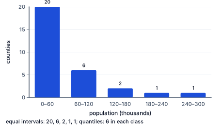
Before choosing breaks, cartographers plot the values in a histogram or along a number line. Evenly spread data suit equal intervals; skewed data, with a long tail of high values, often suit quantiles or natural breaks; clustered data suit natural breaks. In the histogram, each bar is one equal-interval class: twenty of the thirty counties share the lowest, so an equal-interval map would paint most of the state one shade.
The median and interquartile range summarize a skewed distribution better than the mean and range, which a few extreme values can drag.
Checking an answer. Equal-interval bounds must end exactly at the maximum after the last class. Quantile classes must hold equal numbers of areas.
Dividing the range evenly is allowed because equal interval promises equal widths, and the range is the whole span to be split. Taking the middle sorted value as the median is allowed because it splits the data into two equal halves by count.
Reporting the method is required because the classes are choices, and a reader cannot judge a choice that is hidden.
Most choropleths use five to seven classes, because readers struggle to tell more shades apart. The colors should step evenly from light to dark for data that run from low to high.
For data with a meaningful middle, such as change that can be positive or negative, a diverging scheme with two hues and a neutral center works better.
Besides equal intervals and quantiles, many maps use natural breaks, a method developed by the geographer George Jenks, which places class boundaries at the gaps in the data so that values within a class are as alike as possible and classes differ as much as possible.
Natural breaks suit data with clear clusters, but they change whenever the data changes, so two years of the same map cannot be compared class by class. For a series of maps over time, fixed breaks chosen once and kept, often round numbers, let a reader see real change instead of shifting classes.
The most common slip is dividing the maximum, not the range, by the number of classes. Another is reading the middle of an unsorted list as the median.
A third is treating class breaks as facts about the world rather than choices. A fourth is comparing two maps classified by different methods as if their shades meant the same thing.
The Census Bureau publishes median household income for every county in the United States from the American Community Survey. News organizations often map it as a choropleth, and the classification changes the picture.
Income across counties is skewed: most counties cluster in a middle band, with a long tail of high-income suburban counties near large cities. An equal-interval map puts most of the country in one or two middle shades, with a few dark suburbs. A quantile map spreads every shade evenly and makes differences between neighboring rural counties look much starker.
Both maps are honest about the data; they answer different questions. Careful news graphics state the method, show the break values, and sometimes add a histogram so readers can see how the counties are spread.
The U.S. Drought Monitor, produced weekly by federal agencies and the University of Nebraska, maps drought in five categories, from abnormally dry to exceptional drought. Its categories are defined by percentiles: exceptional drought means conditions as dry as the driest two percent of years on record for that place.
Defining classes by percentiles makes the map comparable across very different climates. A dry spell in normally wet Georgia and one in normally dry Arizona are judged against each place's own history, not against one national scale of rainfall.
Farmers, water managers and the federal government use the categories to trigger disaster aid, so the choice of class breaks has real consequences for who receives help and when.
A choropleth's classes look like part of the data, as if the world itself came sorted into five shades. They are choices: the same values classified by equal intervals, quantiles or natural breaks can move a county from the lightest class to the darkest.
Read the legend for the method and breaks, and when the story matters, look at the data's distribution before trusting the map's impression.
Values run from $20$ to $84$ in $8$ classes. Find the range.
$84 - 20 = 64$
Maximum minus minimum.
Find the width.
$\dfrac{64}{8} = 8$
Equal intervals.
Find the first three upper bounds.
$28, 36, 44$
Adding a width each time.
Check the last bound.
$20 + 8 \times 8 = 84$
The maximum.
Rates: $12, 45, 18, 30, 22, 51, 27$. Sort them.
$12, 18, 22, 27, 30, 45, 51$
Smallest to largest.
Find the middle position.
$\text{fourth of seven}$
Three on each side.
Read the median.
$27$
The middle value.
Name the slip to avoid.
$30, \text{ the unsorted fourth}$
Sort first.
Say what a two-class quantile map does.
$\text{breaks at } 27$
Three counties below, three above.
Ten counties have rates $10, 11, 12, 12, 13, 14, 15, 16, 18, 60$. Find the range.
$60 - 10 = 50$
One extreme county.
Find the width for five equal intervals.
$\dfrac{50}{5} = 10$
Classes ten wide.
Count the counties in the lowest class, $10$ to $20$.
$9$
Nearly all of them.
Count the counties in each class of a five-class quantile map.
$\dfrac{10}{5} = 2$
Two per class.
Say what the equal-interval map shows.
$\text{one outlier, the rest alike}$
A calm picture.
Say what the quantile map shows.
$\text{a full range of shades}$
Differences look larger than they are.
Find the range.
$90 - 30 = 60$
Maximum minus minimum.
Divide by the classes.
$\dfrac{60}{3} = 20$
The width.
List the upper bounds.
County rates on a map run from $20$ to $84$. The mapmaker wants $8$ equal-interval classes. How wide is each class?
Complete the worked solution: county values run from $6$ to $46$, and the map uses $8$ equal-interval classes. Find the range, the class width, and the upper bound of the first class.
Find the range.
$\text{maximum} - \text{minimum} =$ r
The spread of values.
Find the width.
$\dfrac{\text{range}}{\text{classes}} =$ w
Equal intervals.
Find the first upper bound.
$\text{minimum} + \text{width} =$ u
The end of class one.
Say what to check next.
$\text{how many counties fall in each class}$
Empty classes waste colors.
Match each classification method to how it draws its breaks.
| classes of equal width across the range | the same number of areas in each class | breaks placed at the largest gaps between values | classes measured above and below the mean | |
|---|---|---|---|---|
| equal interval | ||||
| quantile | ||||
| natural breaks | ||||
| standard deviation |
An equal-interval scheme starts at $5$ with classes $25$ wide. Fill in the upper bounds of the first three classes.
| bound | |
|---|---|
| first class's upper bound | |
| second class's upper bound | |
| third class's upper bound |
An equal-interval scheme starts at $20$ with classes $8$ wide. Write the upper bound of class $n$ as a function of $n$.
Answer:
Seven counties have these rates: $12$, $45$, $18$, $30$, $22$, $51$ and $27$. A two-class quantile map breaks at the median. What is the median?
Answer:
Texas has $254$ counties. A quantile map of median household income there uses $2$ classes. How many counties fall in each class?
Answer: counties
A fictional heat study has 2 unmeasured neighborhoods. Analyst A interpolates temperatures from nearby sensors, changes equal-interval classes to quantiles, then merges neighborhoods. The apparent hottest area changes. Which evaluation separates the three choices?
Lesson test: one question per skill, one attempt each, no hints. Your answers are checked when you submit.
An equal-interval scheme starts at $20$ with classes $8$ wide. Write the upper bound of class $n$ as a function of $n$.
Answer:
You can judge a map's classes. Explain how a quantile map can make small differences look large.
25. Your turn: values run from $30$ to $90$ in $3$ equal-interval classes. How wide is each class?, step 3
$50, 70, 90$
Adding a width each time.