Back to the on-screen lesson ·
Why every flat map of the world stretches something, what Mercator's map keeps and gives up, and how to choose a map for a job.
Paper packet. Every task here also exists on screen, where it is checked automatically; answers written on paper are not assessed by Nydus. When you are back at a device, enter your answers there.
You will say what a named world map keeps true and what it stretches, find where Mercator's map distorts most, work out how much it swells an area, and choose the right kind of map for a question.
You know that a globe is a model of the Earth, and that latitude lines run around it parallel to the Equator. On a globe those lines get shorter toward the Poles until they shrink to a point. Keep that picture in mind: it is exactly what a flat map has to deal with.
| Term | What it means |
|---|---|
| Projection | A method of flattening the round Earth onto paper or a screen. |
| Distort | To pull something out of its true shape or size. |
| Equal-area map | A map that keeps the sizes of areas true, at the cost of shapes. |
| Mercator map | A map from 1569 that keeps compass directions true and swells land near the Poles. |
| Compromise map | A map, such as the Robinson, that keeps nothing exactly and nothing badly wrong. |
| Great circle | The shortest route between two places on a globe. |
Try to press half an orange peel flat on a table. It splits, or it stretches, or both. The Earth's surface is the same: it cannot be laid flat without being pulled out of shape somewhere. A map maker therefore has to decide what to keep true and what to let go wrong. There are four things they might want to keep: the shapes of places, their areas, the distances between them, and directions. No flat map keeps all four everywhere.
In 1569 Gerardus Mercator drew a world map for sailors. On it, a line of constant compass direction is perfectly straight, which made it wonderful for navigation. To manage that, he stretched the map more and more toward the Poles. Greenland, with about 2.2 million km², ends up looking almost as big as Africa, with about 30.4 million km², although Africa is about fourteen times bigger.
Another way: diagram
Picture the latitude lines on a globe as rings that get smaller toward the Poles. Mercator's map draws every ring the same length as the Equator. A ring near the Pole must be stretched a lot to reach that length, and so must everything drawn along it.
Another way: story
In 1973 the historian Arno Peters promoted an equal-area map, first drawn by James Gall in 1855, arguing that Mercator's map made Europe and North America look more important than they are. His map keeps sizes true and squashes shapes, so Africa looks long and thin. Neither map is wrong. Each chose a different trade.
A globe avoids the flattening distortions of a world map, but a small globe cannot show a footbridge inside a town. Scale controls how much local detail can fit. A flat map that preserves relative areas is useful for comparing amounts of land; it does not automatically preserve every distance or direction. A Mercator map preserves local angles and makes constant compass headings straight, but a straight route on it is generally not the shortest surface route. Choose the property needed for the question, then check scale, key and date. If the needed feature is omitted, changing your ruler cannot recover it.
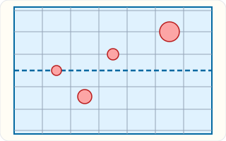
On this Mercator grid the four red circles all stand for circles of the same size on the globe. The one on the Equator is drawn smallest; the one on the second line above it, about $60° N$, is drawn about twice as wide. Its area on the map is about four times too big.
| Map | Keeps true | Gives up |
|---|---|---|
| Globe | everything | it is not flat, so it will not fold into a book |
| Mercator | compass directions, shapes of small areas | sizes near the Poles |
| Equal-area (Gall-Peters) | sizes of areas | shapes |
| Compromise (Robinson, Winkel tripel) | nothing exactly | nothing badly |
On a globe, the parallel at $60° N$ is only half as long as the Equator. A flat rectangular map draws every parallel as a line the same width as the Equator, so the $60°$ parallel has to be stretched to twice its length.
Everything along that parallel is stretched the same way. That is the whole reason Mercator's map swells Canada, Alaska, Russia and Greenland: they sit on short parallels drawn long.
Mercator made his map stretch north-south by the same amount as east-west at every point. That keeps small shapes right, because a small square stays a square, just a bigger one.
But areas grow with both directions. At $60° N$ things are drawn twice as wide and twice as tall, so an area is drawn $2 \times 2 = 4$ times too big. At about $76° N$ the stretch is four in each direction, and an area is drawn sixteen times too big.
A sailor with a compass holds one heading for days. On Mercator's map a line that keeps one compass heading is perfectly straight, so a navigator could rule a line from port to port and read the heading off with a protractor.
No other map of its time could do that. It is why Mercator's projection ruled ocean navigation for centuries, and why sea charts still use it.
The shortest route between two places on a globe is part of a great circle, a circle that cuts the globe into two equal halves. On Mercator's map a great-circle route usually looks curved, bending toward the Pole.
That is why a flight from Chicago to Tokyo heads north over Alaska instead of straight west across the Pacific. On a globe, stretch a string between the two cities and it runs over the far north too.
An equal-area map keeps every area in true proportion, so Africa is drawn about fourteen times as big as Greenland, as it really is. The price is shape: countries near the Equator look tall and thin, and those near the Poles look squat.
Equal-area maps are the right choice whenever a map compares amounts: how much forest, how much farmland, how many people per square mile.
Many atlases and classroom maps use a compromise, such as the Robinson projection adopted by the National Geographic Society in 1988, or the Winkel tripel it switched to in 1998.
A compromise map keeps nothing exactly, but it keeps shapes, sizes and distances all roughly right. It is a good choice for a general map of the world, where no single measurement matters most.
Checking an answer. If a map makes a far-northern country look as big as one near the Equator, check its projection before believing the sizes.
A sphere and a plane have different shapes, a fact proved by mathematicians centuries ago: no flat map can keep every distance on a sphere true. So every map must choose, and asking what it chose is always a fair question.
Multiplying the east-west stretch by the north-south stretch to find the area stretch is allowed because area is width times height. Stretch both, and the area grows by the product.
A map that swells the north makes northern countries look larger and, some argue, more important. Countries near the Equator, in Africa, South America and southern Asia, look smaller than they are.
Neither choice is neutral. That is why geographers ask of every map who made it, for what purpose, and what it lets the reader see. Later lessons return to that question.
Most online maps, such as those on phones, use a version of Mercator's projection. It lets you zoom in on any street without shapes going wrong, which matters far more to someone finding a café than the size of Greenland.
When you zoom out to the whole world, the same stretching appears: Alaska looks nearly as big as the lower 48 states together, though it is about a fifth of their area.
When two places look similar in size on a map, look up their areas. Alaska covers about $1.7$ million km² and the contiguous United States about $8.1$ million km², so the lower 48 are nearly five times bigger.
Dividing the larger area by the smaller tells you how many times one would fit into the other. That number is a fact about the world; the picture on a Mercator map is not.
The most common slip is reading true sizes off a Mercator map. Another is thinking a straight line on a map is always the shortest route.
A third is believing the familiar map on the wall is the true one, when it is simply the one people are used to. A fourth is forgetting that area stretch multiplies width stretch by height stretch.
A flight from New York to Hong Kong does not head west across the Pacific, the way a straight line on a Mercator map suggests. It flies north over Canada, close to the North Pole, and down over Siberia and China.
The reason is the great circle. On a globe, the shortest path between two cities is an arc of a circle that cuts the Earth in half, and for cities in the north it bends toward the Pole. On a Mercator map that arc looks like a long detour. Stretch a string across a globe between the two cities and you will see the polar route is the short one.
Polar routes became common in the 1990s and 2000s as airlines received permission to fly over Russia and aircraft could fly farther from airports. They save hours of flying and tons of fuel, and they show why pilots plan on globes and great-circle charts, not on the stretched map that hangs in classrooms.
In 2017 the Boston Public Schools began hanging Gall-Peters maps beside the familiar Mercator maps in social studies classrooms. District leaders said students should see Africa and South America at their true size, instead of dwarfed by Europe, North America and Greenland.
Teachers used the two maps side by side. On the Mercator map, Greenland looks nearly the size of Africa; on the equal-area map, Africa is shown fourteen times larger, as measurements say it is. Students could see that each map had made a choice, and ask which choice fitted which question.
The change drew attention across the country. Some geographers noted that the Gall-Peters map distorts shapes badly and suggested other equal-area maps. That debate is the lesson in action: there is no perfect flat map, only maps chosen for a purpose, and a careful reader asks what each one keeps true.
One world map can show everything exactly. It cannot. Flattening a ball means stretching it, and every projection chooses where.
The map on the wall is the true one. It is only the familiar one. Many classrooms hang Mercator's map, which was made for steering ships, not for comparing the sizes of countries.
A straight line on a map is the shortest route. On Mercator's map a straight line keeps one compass direction. Airplanes flying from North America to Asia follow a curve that looks longer on that map and is really shorter.
On a Mercator map they look close in size. Record what the map shows.
$\text{Greenland} \approx \text{Africa on the map}$
Start with the picture.
Check where each place is.
$72° \text{ N}\ \text{vs. across } 0°$
Greenland is near the Pole.
Compare the measured areas.
$30.4 \div 2.2 \approx 14$
Millions of km².
State the conclusion.
$\text{Africa} \approx 14 \times \text{Greenland}$
Trust measurements over a stretched picture.
At $60° N$ Mercator draws things twice as wide. Record the width stretch.
$\times 2$
East-west.
It also draws them twice as tall. Record the height stretch.
$\times 2$
North-south.
Find the area stretch.
$2 \times 2 = 4$
Width times height.
A lake there covers $300$ km². Find its drawn area.
$300 \times 4 = 1200\ \text{km}^2$
As the map shows it.
Find the area the map adds.
$1200 - 300 = 900\ \text{km}^2$
Land that is not there.
A ship's navigator needs to hold one compass heading. Name the map.
$\text{Mercator}$
It keeps directions.
A scientist compares areas of forest. Name the map.
$\text{equal-area}$
It keeps sizes.
A teacher wants a general world map for the wall. Name the map.
$\text{compromise}$
Nothing badly wrong.
An airline plans the shortest route. Name the tool.
$\text{a globe or a great circle}$
Straight on Mercator is not shortest.
Name the question to ask of any map.
$\text{what does it keep true?}$
Then use it for that.
State the rule.
$\text{no map is best for everything}$
Match the map to the question.
Place Antarctica on the map.
$\text{around the South Pole}$
The far bottom of the map.
Recall where Mercator stretches most.
Say how it looks.
Gerardus Mercator published his world map in 1569, and sailors used it for hundreds of years. What made it so useful to them?
Complete the worked solution: at about $60°$ N, Mercator's map draws everything $2$ times as wide and $2$ times as tall as at the Equator. A lake there really covers $300$ km². Find how many times its area is swollen, its area as drawn, and how much extra area the map adds.
Multiply the two stretches.
$\text{wider} \times \text{taller} =$ f
Area uses both directions.
Swell the lake's true area.
$\text{true area} \times \text{area stretch} =$ p
Its size on the map.
Find the area the map adds.
$\text{drawn} - \text{true} =$ d
Land that is not really there.
Say what an equal-area map would draw.
$\text{the true area}$
It keeps sizes, not shapes.
A charity is making a poster to compare how much rainforest is left in Brazil, the Congo basin in Africa and Indonesia. Which world map should the poster use?
Match each way of showing the world to what it keeps true.
| the true size of every area, with shapes squashed | shapes, sizes, distances and directions, all at once | nothing exactly, but nothing badly wrong either | compass directions and the shapes of small areas | |
|---|---|---|---|---|
| a globe | ||||
| Mercator's map | ||||
| an equal-area map, such as Gall-Peters | ||||
| a compromise map, such as Robinson |
Here is part of a student's report about the classroom wall map. Select the sentence that makes a mistake about the real world.
This task has no paper form; do it on a device.
This is the grid of a Mercator map with no land on it. The dashed line is the Equator. Each red circle stands for a circle of exactly the same size on the globe. Click the circle the map has stretched the **most**.
This task has no paper form; do it on a device.
On Mercator's map, how much is each of these real places stretched? Use its rough latitude, and the rule that the stretch grows the farther a place is from the Equator.
| How much is it stretched? | |
|---|---|
| Indonesia, about 0° | |
| Egypt, about 27° N | |
| Greenland, about 72° N | |
| Antarctica, beyond 70° S |
The same Mercator grid: the dashed line is the Equator and all four red circles are the same size on the globe. Click the circle the map shows **closest to its true size**.
This task has no paper form; do it on a device.
Africa covers about $30.4$ million km² and Greenland about $2.2$ million km². On a Mercator map they look nearly the same size. To the nearest whole number, about how many Greenlands would fit into Africa?
Answer:
A class has a small globe and two flat world maps printed to the same width: a Mercator map and an equal-area map. They want to compare land areas, then find a 5-meter footpath inside one town. Which plan respects both projection and scale limits?
Lesson test: one question per skill, one attempt each, no hints. Your answers are checked when you submit.
An equal-area map of an invented region represents two islands. The geographic data gives island A an area of 450 square kilometers and island B an area of 75 square kilometers. How many times as large should A's drawn area be as B's on this equal-area map?
Answer:
You can tell when a map's stretching is fooling you. Tell somebody why Greenland looks as big as Africa on the classroom wall map, and which map they should use to compare sizes. Next: water, and the journey it makes between the sea and the sky.
25. Your turn: Antarctica on a Mercator map, step 2
$\text{near the Poles}$
Short parallels drawn long.
25. Your turn: Antarctica on a Mercator map, step 3
$\text{a giant strip along the bottom}$
Far bigger than it really is.