Back to the on-screen lesson ·
Inequality is a pattern at a stated scale, described by ratios, ranges, medians and shares, and hidden by averages over larger areas.
Paper packet. Every task here also exists on screen, where it is checked automatically; answers written on paper are not assessed by Nydus. When you are back at a device, enter your answers there.
By the end of this lesson you will be able to describe spatial inequality with a ratio, range, mean and median at a stated scale, and explain how averages hide it.
You can find income per person, compare measures of development, and read a percent of a whole. This lesson asks how those measures are spread across space, and shows that the answer depends on the scale at which you look.
| Term | What it means |
|---|---|
| Spatial inequality | Differences in income, health or opportunity from one place to another. |
| Scale | The size of the area being studied: world, country, region, city or neighborhood. |
| Mean | The sum of the values divided by how many there are. |
| Median | The middle value once the values are put in order. |
| Range | The largest value minus the smallest. |
| Core and periphery | A wealthy, well-connected center and the poorer, less-connected areas around it. |
| Redlining | The practice, from the 1930s, of marking neighborhoods as risky for loans, often because of who lived there. |
Spatial inequality is described with numbers that belong to one scale:
$$\text{ratio} = \dfrac{\text{highest}}{\text{lowest}}, \qquad \text{range} = \text{highest} - \text{lowest}.$$
So every statement about inequality must name its scale: between countries, between regions of a country, or between neighborhoods of a city.
Another way: picture
Picture zooming in on a map of household incomes. From space, the United States is one of the richest places on Earth. Zoom to the states and some are far richer than others. Zoom to a single city and rich and poor neighborhoods sit a few blocks apart. Each zoom shows a different pattern.
Another way: steps
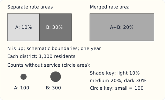
Read the key and common period before comparing these invented districts. The two shades distinguish rates; the lower circles distinguish counts by area. Because the populations are equal, the count and rate rankings agree here. That need not hold with unequal denominators. Follow the boundary change to the right-hand panel: the combined region conceals the contrast between its two parts. Its medium shade does not mean every neighborhood has the combined rate. The shapes are schematic, so the map supports this aggregation comparison but cannot locate individual households or measure travel distances. Re-read the numerical values if class breaks change.
A choropleth fills administrative areas with shades keyed to value classes. It is useful for comparable rates, such as the percentage of residents lacking piped water. A proportional-symbol map varies symbol area with a count; a circle with four times the count needs twice the radius, not four times. Neither representation gives the exact location of every person. A large shaded county occupies much ink even when few people live there.
Read the legend before reading darkness as importance. Suppose invented districts have poverty percentages 8, 9, 11 and 40. Equal-width classes of 0 to under 20 and 20 to 40 put three districts in the low class. A split at 10 puts two in each class. The numbers did not change; the visual contrast did. List class boundaries and the year alongside the conclusion.
Aggregation can conceal inequalities. If a neighborhood with 100 residents has 40 without service and its neighbor has 900 residents with 90 without service, the combined percentage is 130 divided by 1000, or 13 percent. Averaging 40 and 10 percent would wrongly give 25 percent because the groups differ in size. Joining the boundaries hides the smaller neighborhood's 40 percent. The area rate also does not identify an individual's service access. Check smaller areas and household evidence before targeting people. A map comparison is defensible only after checking numerator, denominator, boundaries, date and class breaks.
Incomes, life expectancy, schooling and access to jobs are not spread evenly. They differ between countries, between regions of the same country, and between neighborhoods of the same city. Geographers call this spatial inequality.
Describing it is the first step in explaining it. A clear description names the measure, the places compared, the scale and the year, and gives numbers that show how large the differences are.
At the world scale, the United States is one of the richest countries. At the scale of states, median household income in Maryland or Massachusetts is close to twice that of Mississippi, according to the Census Bureau's American Community Survey. At the scale of neighborhoods, the gaps within one city can be larger still.
None of these descriptions is wrong. Each answers a different question, which is why a statement about inequality must say at which scale it holds.
Two simple measures describe the spread between the richest and poorest places. The range subtracts: $112$ thousand dollars minus $40$ thousand is $72$ thousand. The ratio divides: $112$ over $40$ is $2.8$, so the richest county's income is $2.8$ times the poorest.
The ratio is often more useful for comparing across time or countries, because it does not depend on the currency or on prices rising. A ratio of $2.8$ means the same thing in dollars or in euros.
The mean adds the values and divides by how many there are. The median is the middle value once they are in order. When one county is far richer than the rest, it pulls the mean up but leaves the median where it was.
For five counties with incomes of $42$, $48$, $55$, $61$ and $94$ thousand dollars, the mean is $60$ but the median is $55$. The median better describes the typical county, which is why income statistics usually report medians.
Another measure asks what share of all income goes to the richest fifth of households. If income were shared equally, each fifth would receive twenty percent. In the United States the richest fifth receives about half, according to the Census Bureau.
The further the top fifth's share is above twenty percent, the more unequal the place. Geographers compare these shares between states, cities and countries to see where income is most concentrated.
Combining two districts into one average smooths out the difference between them. A district of $60$ thousand people averaging $30$ thousand dollars and one of $40$ thousand averaging $80$ thousand have a combined mean of $50$ thousand, a figure that describes neither.
The combined mean weights each district by its people: total income over total people. The larger the area averaged, the more such differences disappear, which is why inequality often looks smaller at larger scales.
Many patterns of inequality have a core and a periphery. The core is a wealthy, well-connected center with most of the jobs, investment and services; the periphery is poorer and less connected, often supplying the core with raw materials, food or workers.
The pattern repeats at several scales. The world has core and peripheral countries, a country has core and peripheral regions, and a metropolitan area can have a prosperous core and struggling outer towns, or the reverse.
Some American regions have lagged for generations. Parts of Appalachia, the Mississippi Delta, the Rio Grande Valley and many Native American reservations have lower incomes, shorter lives and fewer jobs than the nation as a whole.
The causes differ: the decline of coal mining in Appalachia, the legacy of plantation farming and segregation in the Delta, and remoteness and broken treaties on many reservations. Naming the pattern is the start; each place needs its own explanation.
Checking an answer. The median lies between the smallest and largest values. A ratio of highest to lowest is at least one. A combined mean lies between the two means it combines.
The median is found after ordering because it is defined as the middle of the ordered values; an unordered middle value means nothing.
A combined mean must weight each district by its people because the total income of the combined area is each district's people times its mean, added together. Taking a simple average of the two means would treat a small district as if it had as many people as a large one.
Inside American cities, incomes, health and schooling can change sharply from one neighborhood to the next. Studies of Chicago, Baltimore and other cities have found life expectancy differing by twenty years or more between neighborhoods a few miles apart.
These gaps follow patterns of housing, jobs, transport and history. Mapping them block by block, using census tracts of a few thousand people each, reveals inequality that a city-wide average would hide completely.
Some patterns of inequality were drawn deliberately. In the 1930s the federal Home Owners' Loan Corporation graded neighborhoods for mortgage lending, marking many Black and immigrant neighborhoods in red as hazardous. Lenders avoided them for decades.
Researchers comparing those maps with today's data have found that many formerly redlined neighborhoods still have lower home values, fewer trees and hotter summer temperatures than the neighborhoods graded best. A pattern set by policy can last long after the policy ends.
Inequality can widen or narrow. To see which, compare the same measure, at the same scale, for the same places, at two dates. A ratio rising from $2.4$ to $2.8$ means the gap between the richest and poorest places has widened.
Changes in boundaries make this tricky. If county lines or neighborhood definitions change, the numbers may shift without anything changing on the ground, so careful studies keep their units fixed.
Income figures miss wealth, such as homes and savings, which is spread even more unequally than income. They also miss the cost of living: a salary goes further in rural Mississippi than in San Francisco.
And they say nothing on their own about why places differ. A description of inequality is a pattern to be explained, with evidence about jobs, history, policy and environment, not an explanation in itself.
The most common slip is giving a difference when a ratio is asked for, or the reverse. Another is finding the median without first putting the values in order.
A third is averaging two district means without weighting them by their people. A fourth is describing inequality without naming the scale, as if the pattern at one scale held at every other.
In the late 1930s the federal Home Owners' Loan Corporation made color-coded maps of more than two hundred American cities. Neighborhoods were graded from A, in green, to D, in red. Many neighborhoods with Black or immigrant residents were colored red and labeled hazardous, and banks largely refused to lend there for decades.
Researchers have since laid those maps over modern data. Formerly redlined neighborhoods tend to have lower home values and rates of homeownership, fewer trees, and summer temperatures several degrees hotter than the neighborhoods graded A, because they have more pavement and less shade.
The story shows why a description of inequality must name its scale and its history. A city's average income hides these neighborhood patterns, and the patterns themselves make sense only when the maps drawn eighty years ago are brought back into view. Several cities now use the old maps to decide where to plant trees and invest first.
In 1965 Congress created the Appalachian Regional Commission to address poverty across a region stretching from southern New York to northern Mississippi. At the time, incomes in much of central Appalachia were far below the national average, and many homes lacked plumbing.
The commission classifies every Appalachian county each year by comparing its unemployment, income per person and poverty with the national averages. Counties in the worst tenth of the nation are labeled distressed and receive more support for roads, water systems, schools and clinics.
Poverty in the region has fallen sharply since the 1960s, but the gap has not closed everywhere. Many distressed counties are clustered in eastern Kentucky and southern West Virginia, where coal mining jobs have declined. Describing the region county by county, rather than as one average, is what lets the commission see where the need is greatest.
It is natural to treat a state's or a city's average income as a description of the people who live there. But an average over a large area can sit between very different parts and describe none of them. A rich district and a poor one can combine into a middling average that no one actually lives at.
So always name the scale, and look at the pieces as well as the whole. The median, the range and the ratio at a smaller scale often reveal inequality that the larger average hides completely.
The richest county in a state has a median income of $120$ thousand dollars. Record it.
$120$
The highest value.
The poorest has $48$ thousand. Find the range.
$120 - 48 = 72$
Thousand dollars apart.
Find the ratio.
$\dfrac{120}{48} = 2.5$
Two and a half times.
Name the scale.
$\text{counties within one state}$
The comparison's level.
Five counties have incomes of $52$, $35$, $84$, $44$ and $40$ thousand. Put them in order.
$35,\ 40,\ 44,\ 52,\ 84$
Smallest to largest.
Find the median.
$44$
The middle value.
Find the mean.
$\dfrac{255}{5} = 51$
Sum over count.
Find the range.
$84 - 35 = 49$
Largest minus smallest.
Explain why the mean is higher.
$\text{one rich county pulls it up}$
The median ignores the extreme.
District A has $90$ thousand people with a mean income of $40$ thousand dollars. Find its total income.
$90 \times 40 = 3600$
Millions of dollars.
District B has $10$ thousand people with a mean of $120$ thousand. Find its total.
$10 \times 120 = 1200$
Millions of dollars.
Add the totals and the people.
$3600 + 1200 = 4800;\ 90 + 10 = 100$
Both districts together.
Find the combined mean.
$\dfrac{4800}{100} = 48$
Thousand dollars.
Compare with the simple average of the two means.
$\dfrac{40 + 120}{2} = 80$
Wrong: it ignores the districts' sizes.
Say what the combined mean hides.
$\text{a small rich district beside a large poorer one}$
Scale smooths the difference.
Write the ratio.
$\dfrac{150}{60}$
Highest over lowest.
Evaluate the ratio.
$2.5$
Times as large.
Name the scale of the comparison.
In a state, the county with the highest median household income has $132$ thousand dollars and the county with the lowest has $48$ thousand. What is the ratio of the highest to the lowest?
Complete the worked solution: district A has $60$ thousand people with a mean income of $30$ thousand dollars, and district B has $40$ thousand people with a mean of $80$ thousand dollars. Find each district's total income, in millions of dollars, and the mean income of the two districts together.
Find district A's total income.
$\text{people} \times \text{mean} =$ s
Thousands times thousands is millions.
Find district B's total income.
$\text{people} \times \text{mean} =$ t
The same rule.
Divide both totals by all the people.
$\dfrac{\text{A} + \text{B}}{\text{all people}} =$ k
The combined mean.
Say what the combined mean hides.
$\text{it describes neither district}$
A larger scale smooths out the difference.
Match each term to its meaning.
| the largest value minus the smallest | how many times larger the largest value is than the smallest | the middle value when the values are put in order | a wealthy center surrounded by poorer outer areas | |
|---|---|---|---|---|
| range | ||||
| ratio of highest to lowest | ||||
| median | ||||
| core-periphery pattern |
Five neighboring counties have median household incomes of $70$, $111$, $58$, $66$ and $60$ thousand dollars. Fill in their mean, their median and their range, in thousands of dollars.
| value | |
|---|---|
| mean (thousand dollars) | |
| median (thousand dollars) | |
| range (thousand dollars) |
In a state, the richest county has a median household income of $84$ thousand dollars. Write the ratio of the highest to the lowest county income as a function of the lowest income $x$, in thousands of dollars.
Answer:
In a region, all households together earn $60$ billion dollars a year, and the richest fifth of households earn $27$ billion of it. What percent of the region's income goes to its richest fifth?
Answer: %
Suppose that in a city in Illinois the richest neighborhood has a median household income of $180$ thousand dollars and the poorest has $45$ thousand. By what percent is the richer neighborhood's income higher?
Answer: %
Districts A and B each have 6 hundred residents. A has 10 percent without water service and B has 30 percent. One choropleth merges them as a 20-percent region; another map uses circle areas proportional to unserved counts. Mark all supported map-reading statements, including what these maps cannot show.
This task has no paper form; do it on a device.
Lesson test: one question per skill, one attempt each, no hints. Your answers are checked when you submit.
In a state, the richest county has a median household income of $132$ thousand dollars. Write the ratio of the highest to the lowest county income as a function of the lowest income $x$, in thousands of dollars.
Answer:
You can describe spatial inequality. Explain how a state's average income can describe none of the places in it.
28. Your turn: the richest and poorest counties in a state have median incomes of $150$ and $60$ thousand dollars. What is the ratio of highest to lowest?, step 3
$\text{counties in one state}$
The level compared.