Back to the on-screen lesson ·
Three ways to show a distribution, and what each is good at.
Paper packet. Every task here also exists on screen, where it is checked automatically; answers written on paper are not assessed by Nydus. When you are back at a device, enter your answers there.
In this lesson you read and make dot plots, histograms and box plots, and choose between them. You group data into equal intervals for a histogram, find the quartiles and the five-number summary for a box plot, and measure spread with the interquartile range. Each display shows something the others hide: a dot plot every value, a histogram the shape, a box plot the middle half. Choosing the display is choosing what you want the reader to see.
You can describe a distribution by its center, spread and shape. You can read a dot plot, find the median of a list by putting it in order, and find the range. You know what a percent is: a number out of 100. This lesson adds two new displays, the histogram and the box plot, and a new measure of spread, the interquartile range, and asks you to choose the right display for a job.
| Term | What it means |
|---|---|
| Dot plot | A number line with one dot for each value, stacked when values repeat. |
| Histogram | A bar graph of numerical data grouped into equal intervals, with bars touching; each bar's height is the number of values in its interval. |
| Interval (bin) | A stretch of the number line, such as 10 to 20, into which a histogram groups values. |
| Frequency | How many values fall in an interval, or take a certain value. |
| Quartiles | The values that cut ordered data into four equal parts: the lower quartile ($Q_1$), the median, and the upper quartile ($Q_3$). |
| Five-number summary | The minimum, lower quartile, median, upper quartile and maximum. |
| Interquartile range (IQR) | The upper quartile minus the lower quartile: the spread of the middle half of the data. |
| Box plot | A display of the five-number summary: a box from $Q_1$ to $Q_3$ with a line at the median, and whiskers out to the minimum and maximum. |
A data set can be drawn in more than one way, and each way shows some things and hides others.
A dot plot draws every value as a dot above a number line. Nothing is lost: you can read back each value. It works well for small data sets, up to about forty values, and shows clusters, gaps and outliers clearly.
A histogram groups the values into equal intervals, such as 0 to 10, 10 to 20 and 20 to 30, and draws a bar for each one. The height of a bar is how many values landed in that interval. You lose the exact values, but you can draw hundreds or thousands of values and still see the shape of the distribution at once.
A box plot keeps only five numbers: the least value, the lower quartile, the median, the upper quartile and the greatest value. The box shows where the middle half of the data lies, and the whiskers show how far the rest reaches. Box plots are the best display for comparing two or more groups side by side.
Choosing a display is choosing what the reader should notice.
Another way: picture
Imagine a class photo, a head count by row, and a single sentence saying 'the shortest student is 132 cm, the tallest 168 cm, and the middle half are between 141 and 155 cm.' The photo is the dot plot: everyone is there. The head count by row is the histogram. The sentence is the box plot: a quick summary that fits on one line.
Another way: hands on
Line up eleven classmates by height. The 6th person is the median. Among the five shorter people, the one in the middle, the 3rd, is the lower quartile; among the five taller people, the 3rd from the median is the upper quartile. Those two students and everyone between them are the middle half, the box of the box plot.
To make a histogram:
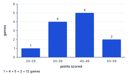
For the points a team scored in 12 games, 34, 41, 28, 45, 52, 39, 47, 31, 44, 58, 42 and 36, the counts are:
| Points | 20–29 | 30–39 | 40–49 | 50–59 |
|---|---|---|---|---|
| Games | 1 | 4 | 5 | 2 |
To read a histogram, remember that a bar is a count, not a value. You can say that 5 games had between 40 and 49 points, but not what the exact score was in any of them. You can add bars to answer questions like 'how many games had fewer than 40 points?' ($1 + 4 = 5$), and you can see the shape: this one rises to a peak in the 40s and falls off on both sides.
This is the histogram of the 12 game scores above. Each bar stands over one interval of 10 points, and its height is the number of games in that interval, not a score. Read the heights from left to right: 1 game in the 20s, 4 in the 30s, 5 in the 40s and 2 in the 50s. The tallest bar, over 40 to 49, is where the scores pile up, and the bars fall away on both sides, so the shape is a single hump. To check the picture against the data, add the heights: $1 + 4 + 5 + 2 = 12$, one for every game. Notice what the histogram hides: you can see that 5 games scored in the 40s, but not that one of them was 41 and another 47. On paper the bars of a histogram touch, because the intervals meet with no space between them; this drawing leaves a thin gap only so that each count can be printed above its bar.
The median cuts ordered data into two halves. The quartiles cut each half in two again, so the data is split into four quarters with about the same number of values in each.
With the least and greatest values, these make the five-number summary. For 3, 5, 6, 8, 9, 11, 14, the median is 8, the lower half is 3, 5, 6 with median 5, and the upper half is 9, 11, 14 with median 11. The summary is 3, 5, 8, 11, 14.
When a half has an even number of values, its median is halfway between its two middle values, exactly as for any median.
To draw a box plot, draw a number line that covers the data. Above it, draw a box from $Q_1$ to $Q_3$ and a line across the box at the median. Then draw whiskers, straight lines from the box out to the minimum and the maximum.
Each of the four pieces, left whisker, left part of the box, right part of the box and right whisker, holds about a quarter of the data. So the box always holds about half of the values, whether it is long or short. A short piece means the values in that quarter are packed tightly; a long piece means they are spread out.
The length of the box is the interquartile range, $Q_3 - Q_1$. It is the spread of the middle half of the data. Unlike the range, it ignores the extreme values, so one outlier cannot stretch it. For the summary 3, 5, 8, 11, 14 the IQR is $11 - 5 = 6$ and the range is $14 - 3 = 11$.
Two box plots drawn on the same number line make comparisons easy: which median is higher, which box is longer, whose whiskers reach further.
Each display is a trade. The dot plot keeps everything but gets crowded. The histogram handles large data sets and shows shape, but loses the exact values. The box plot is the most compact and the best for comparisons, but hides the shape inside each quarter: a box plot cannot show two clusters, and it cannot tell you how many values there were.
| Question | Best display |
|---|---|
| What was each value? | Dot plot |
| What is the shape of a large data set? | Histogram |
| Where is the middle half, and how do groups compare? | Box plot |
When you are not sure, draw more than one. Scientists often draw a histogram to look at the shape of their data and then a box plot to compare groups.
To build a box plot from a list:
To check:
Hospitals keep track of the birth weights of the babies born there. Most full-term babies weigh between about 5.5 and 10 pounds. With thousands of births a year, a dot plot would be a smear, so the hospital uses a histogram with intervals of half a pound. Suppose a month's report has 200 babies, with bars of 6, 14, 30, 46, 50, 32, 14 and 8 for the intervals from 5.5 to 9.5 pounds. The total is 200, the tallest bar is 7.5 to 8 pounds, and the shape is close to symmetric. The first bar, 6 babies below 6 pounds, is $6 \div 200 = 3\%$ of the births. If that bar suddenly doubled one month, the doctors would notice at a glance and look for the reason. The histogram turns 200 numbers into a picture a busy doctor can read in seconds.
A track coach wants to know whether a new warm-up routine helps. Before the change, the team's 100-meter times had a five-number summary of 12.8, 13.4, 13.9, 14.6 and 16.2 seconds. After six weeks it was 12.6, 13.1, 13.5, 13.9 and 15.0 seconds. Drawn on one number line, the second box sits to the left, so the typical time is faster: the median fell by $13.9 - 13.5 = 0.4$ seconds. The box is also shorter, with an IQR of $13.9 - 13.1 = 0.8$ seconds instead of $14.6 - 13.4 = 1.2$ seconds, so the runners' times are more consistent. Two small pictures answer both of the coach's questions, 'faster?' and 'more even?', without a single table.
Reading a histogram bar as a value. A bar's height is how many values are in the interval, not the values themselves.
Unequal intervals. A histogram with intervals of 0–10, 10–30 and 30–35 gives a false picture of the shape. Keep every interval the same width.
Thinking a longer piece of a box plot holds more data. Every quarter holds the same number of values; a longer piece just means they are more spread out.
Finding quartiles from the unordered list. Order first, always.
Mixing up the range and the IQR. The range uses the whisker ends; the IQR uses the ends of the box.
A histogram of 30 students' mile run times has bars of 3, 9, 11, 5 and 2 students for the intervals 6–8, 8–10, 10–12, 12–14 and 14–16 minutes. Check the total.
$3 + 9 + 11 + 5 + 2 = 30$
Every student is counted in exactly one bar.
Find the tallest bar.
$11 \text{ students in } 10\text{–}12 \text{ minutes}$
The tallest bar is the interval where the most times landed.
Count the students who ran faster than 10 minutes.
$3 + 9 = 12$
The 6–8 and 8–10 bars both lie below 10 minutes.
Write that as a fraction of the class.
$\dfrac{12}{30} = \dfrac{2}{5}$
Twelve out of thirty is the same as two out of five.
Say what the histogram cannot tell you.
$\text{fastest time: somewhere in } 6\text{–}8 \text{ minutes}$
A histogram keeps only counts per interval, so the exact fastest time is lost.
A team scored 34, 41, 28, 45, 52, 39, 47, 31, 44, 58, 42 and 36 points. Choose equal intervals.
$20\text{–}29, \; 30\text{–}39, \; 40\text{–}49, \; 50\text{–}59$
Intervals of 10 points cover every score from 28 to 58, and each score fits in exactly one.
Count the scores in the 20s.
$28 \to 1$
Only one game had fewer than 30 points.
Count the scores in the 30s.
$34, 39, 31, 36 \to 4$
Go through the list once and pick out each score from 30 to 39.
Count the scores in the 40s.
$41, 45, 47, 44, 42 \to 5$
Same pass, for 40 to 49.
Count the scores in the 50s.
$52, 58 \to 2$
The last interval.
Check the counts and describe the shape.
$1 + 4 + 5 + 2 = 12$
All 12 games are counted. The bars rise to a peak in the 40s and fall off on both sides.
Eleven students practiced piano for 15, 20, 20, 25, 30, 30, 35, 40, 45, 50 and 70 minutes. The list is in order; find the median.
$(11 + 1) \div 2 = 6, \qquad \text{median} = 30$
The 6th value has five values on each side.
Write the lower half.
$15, \; 20, \; 20, \; 25, \; 30$
The five values before the median, leaving the median out.
Find the lower quartile.
$Q_1 = 20$
It is the middle, the 3rd, of the lower half.
Write the upper half and find the upper quartile.
$35, \; 40, \; \mathbf{45}, \; 50, \; 70 \quad \to \quad Q_3 = 45$
The five values after the median; the middle one is 45.
Write the five-number summary.
$15, \; 20, \; 30, \; 45, \; 70$
Minimum, lower quartile, median, upper quartile, maximum.
Find the IQR.
$45 - 20 = 25 \text{ minutes}$
The middle half of the students practiced within a 25-minute stretch.
Find the range.
$70 - 15 = 55 \text{ minutes}$
The range is more than twice the IQR because one student practiced far longer than the rest.
Describe the box plot.
$\text{box } 20 \text{ to } 45, \text{ median line at } 30, \text{ whiskers to } 15 \text{ and } 70$
The long right whisker shows the data is skewed right.
Find the median.
$(7 + 1) \div 2 = 4, \qquad \text{median} = 8$
The 4th of seven values.
Find the quartiles.
$3, \mathbf{5}, 6 \to Q_1 = 5, \qquad 9, \mathbf{11}, 14 \to Q_3 = 11$
The middle of each half, leaving the median out.
Find the IQR.
A report needs to show every one of the 18 scores on a spelling quiz, so each student can find their own. Which display fits best?
Seven fish caught on a lake measure, in order, 21, 25, 29, 33, 36, 43 and 45 centimeters. Complete the worked solution to find the median, the quartiles and the interquartile range.
Find the position of the median.
$(7 + 1) \div 2 = 4$
Three values lie before the 4th and three after it.
Read the median.
$\text{4th value} =$ med cm
The median splits the fish into a shorter half and a longer half.
Find the lower quartile, the middle of the three values below the median.
$\text{2nd value} =$ q1 cm
The lower half is the 1st, 2nd and 3rd values, and its middle is the 2nd.
Find the upper quartile, the middle of the three values above the median.
$\text{6th value} =$ q3 cm
The upper half is the 5th, 6th and 7th values, and its middle is the 6th.
Subtract the quartiles.
$Q_3 - Q_1 =$ iqr cm
The interquartile range is the spread of the middle half of the data.
A class of 37 students measured their hand spans. Match each display of the data with what it shows.
| each of the 37 hand spans as its own mark | how many spans fall in each equal interval | the least, the quartiles, the median and the greatest span | |
|---|---|---|---|
| dot plot | |||
| histogram | |||
| box plot |
A box plot of the number of seconds students could hold their breath has its whiskers ending at 32 and 67 seconds. Its box runs from 44 to 54 seconds, with the median line at 47. Find the range, the IQR, and the percent of students whose times are inside the box.
The range is rng seconds, the IQR is iqr seconds, and pct percent of the students are inside the box.
A histogram shows how long a class's paper airplanes flew. Its bars are 2 planes for 0 to 5 meters, 6 for 5 to 10, 12 for 10 to 15, 6 for 15 to 20 and 3 for 20 to 25 meters. How many planes were thrown, and how many flew less than 10 meters?
total planes were thrown, and short flew less than 10 meters.
Nine students' resting heart rates, in beats per minute, are 62, 66, 67, 71, 75, 80, 86, 87 and 99, already in order. Complete the five-number summary.
| Beats per minute | |
|---|---|
| Minimum | |
| Lower quartile | |
| Median | |
| Upper quartile | |
| Maximum |
Two basketball teams record how many points they score in each game. Team A's box plot has lower quartile 52, median 55 and upper quartile 62. Team B's has lower quartile 41, median 49 and upper quartile 58. How far apart are the medians, and what is each team's IQR?
The medians are diff points apart. Team A's IQR is ia points and Team B's IQR is ib points.
A science museum records the ages of 25 visitors in one hour. Its histogram has 4 visitors aged 0 to 9, 3 aged 10 to 19, 6 aged 20 to 29, 4 aged 30 to 39 and 8 aged 40 to 49. How many visitors were under 20, and what percent of the visitors is that?
count visitors were under 20, which is pct percent of the visitors.
Lesson test: one question per skill, one attempt each, no hints. Your answers are checked when you submit.
A music teacher asks eleven students how many minutes they practiced yesterday. In order, the answers are 12, 14, 17, 20, 25, 29, 35, 39, 40, 48 and 57. Find the lower quartile, the median, the upper quartile and the interquartile range.
The lower quartile is q1 minutes, the median is med minutes, the upper quartile is q3 minutes, and the IQR is iqr minutes.
You can read, make and choose between the three displays. Without looking: which display shows every individual value, what does the box of a box plot hold, and how do you find the interquartile range?
17. Your turn: find the five-number summary and IQR of 3, 5, 6, 8, 9, 11, 14, step 3
$11 - 5 = 6$
Upper quartile minus lower quartile.