Back to the on-screen lesson ·
Drawing a line through a scatter, and reading its slope in the units of the data.
Paper packet. Every task here also exists on screen, where it is checked automatically; answers written on paper are not assessed by Nydus. When you are back at a device, enter your answers there.
In this lesson you fit a straight line to a scatter of points and use it to predict. The slope is a rate in the units of the data, such as inches per year or cups per degree, and saying what it means in those words is the point of doing it. Real data scatters around the line, so a prediction is an estimate and not a promise.
You can plot points $(x, y)$ on a coordinate grid. You can find the slope of a line from two of its points, as rise over run, and you can write its equation in the form $y = mx + b$, where $m$ is the slope and $b$ is the $y$-intercept. You have built linear models from a rate and a starting value, such as a taxi fare of $3$ dollars plus $2$ dollars a mile. You have also seen scatter plots: a dot for each person or day, with one measurement across and another up. In a scatter plot the points do not sit on a line. This lesson shows how to draw one line that follows them anyway, and how to use it.
| Term | What it means |
|---|---|
| Scatter plot | A graph of paired data: one dot for each item, placed by its two measurements. |
| Association | A pattern between two variables. Positive: both rise together. Negative: one falls as the other rises. |
| Fitted line (trend line) | A straight line drawn to follow the pattern of the points as closely as possible. |
| Predicted value | The $y$-value the fitted line gives for a chosen $x$. |
| Residual | Actual value minus predicted value: how far a point sits above (positive) or below (negative) the line. |
| Interpolation | Predicting for an $x$ inside the range of the data. Usually reasonable. |
| Extrapolation | Predicting for an $x$ outside the range of the data. Risky, and worse the farther you go. |
Real data is never perfectly neat. Ten days of lemonade sales, twenty students' arm spans and heights, fifty used cars and their prices: each makes a cloud of points, not a line. But often the cloud has a clear direction. It rises from left to right, or falls, and it stays in a fairly narrow band. When it does, we say the data has a linear association, and we can summarize the whole cloud with one straight line.
That line is called a fitted line or trend line. It does not pass through every point. It usually passes through very few of them. Its job is to run through the middle of the cloud, so that the points are spread fairly on both sides of it. A good rule of thumb for a line drawn by eye is: about half the points above, about half below, and the line following the direction of the cloud, not just joining the two end points.
Once the line is drawn, you pick two points on the line (not data points, unless they happen to sit on it), find the slope as rise over run, and write the equation $y = mx + b$. From then on the line is a tool. Its slope is a rate in the units of the data, such as cups of lemonade per degree. Its intercept is where the line starts at $x = 0$, which may or may not make sense. And putting in a new $x$ gives a prediction: an estimate of the typical $y$, not a promise.
Another way: picture
Stretch a piece of uncooked spaghetti across a printed scatter plot. Turn and slide it until it lies along the cloud with the points balanced on each side. Where it lies is your fitted line.
Another way: numbers
For each point, the residual is actual minus predicted. A well-placed line has residuals that are small, with about as many positive as negative ones, and no long run of one sign at one end.
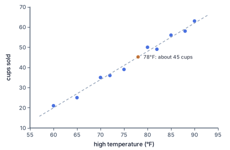
Maya ran a lemonade stand for ten summer days and wrote down each day's high temperature and the number of cups she sold.
| High ($^\circ$F) | 60 | 65 | 70 | 72 | 75 | 80 | 82 | 85 | 88 | 90 |
|---|---|---|---|---|---|---|---|---|---|---|
| Cups sold | 21 | 25 | 35 | 36 | 39 | 50 | 49 | 56 | 58 | 63 |
Look at the scatter plot. Each blue dot is one day. The dots climb from the lower left to the upper right, so hotter days go with more cups: a positive association. They also stay in a narrow band, so a straight line describes them well. The dashed line is the one Maya drew by eye. Count the dots: five sit above the line and five below, and none is far from it. The line passes through $(60, 20)$ and $(90, 62)$, which are points on the line, not days in the table. The orange mark shows how she used it: at $78^\circ$F the line reads about $45$ cups, so that is how many cups she should be ready to sell on a $78$-degree day.
Many lines could be drawn through the same cloud. Some are better than others, and you can check yours in three ways.
Balance. Roughly the same number of points should sit above the line as below it. If eight of ten points are above, the line is too low; slide it up.
Direction. The line should follow the tilt of the cloud. A common error is to join the first and last points. If either of them is unusual, the line tilts the wrong way for everything in between. Look at the whole band, not the two ends.
No pattern in the misses. Work out a few residuals. If the points are above the line at the left end and below it at the right end, the line is too steep. The misses should be mixed along the whole line.
Two people fitting lines by eye will get slightly different equations, and that is fine. Maya's line has slope $1.4$; a classmate's might have slope $1.3$ or $1.5$. Both are reasonable if they pass the three checks. In high school you will meet a method, called least squares, that gives one exact best line; the idea behind it is the same one you use here, making the residuals as small as possible overall.
The numbers in $y = mx + b$ have units, and saying them in words is how you show you understand the line.
The slope has units of $y$ per unit of $x$. Maya's slope is $\frac{62 - 20}{90 - 60} = \frac{42}{30} = 1.4$ cups per degree. In a sentence: for each extra degree of heat, she sells about $1.4$ more cups. Because single degrees are small, it can help to scale it up: about $7$ more cups for every $5$ degrees.
A negative slope means the $y$ quantity goes down as $x$ goes up. A line fitted to ticket prices and attendance might have slope $-200$ fans per dollar: each extra dollar goes with about $200$ fewer fans.
The intercept is the predicted $y$ when $x = 0$. Maya's is $-64$ cups at $0^\circ$F, which is impossible: you cannot sell a negative number of cups. That does not make the line bad. It only means $x = 0$ is far from any day in her data, so the intercept is a number that sets the height of the line and nothing more. Always ask whether $x = 0$ makes sense before you describe the intercept as a real starting value.
To predict, put the $x$-value into the equation. For a $78$-degree day, $1.4 \times 78 - 64 = 109.2 - 64 = 45.2$, so about $45$ cups. You can also run it backwards: to find the temperature at which the line predicts $50$ cups, solve $1.4x - 64 = 50$, which gives $x = 114 \div 1.4 \approx 81$ degrees.
A prediction inside the range of the data, here between $60$ and $90$ degrees, is called interpolation. The points around it back it up, so it is usually trustworthy to within a few cups.
A prediction outside that range is extrapolation, and it gets less trustworthy the farther you go. The line says a $110$-degree day brings $90$ cups. But on a day that hot, people may stay indoors, and Maya may run out of lemons. Nothing in her data tells us what happens there. The line is only a description of the days she measured.
Finally, a fitted line shows that two things move together. It does not prove that one causes the other. Heat really does make people thirsty, but ice cream sales and sunburns also rise together, and neither causes the other: sunny weather drives both.
How to check. Put the second point into your equation: it must give the right $y$, or the slope or intercept is wrong. Then work out two or three residuals. If they are small and mixed in sign, your line fits. If they are all one sign, move the line.
Old Faithful, the geyser in Yellowstone National Park, erupts many times a day, but not on a fixed clock. The gap between eruptions ranges from about $60$ to $110$ minutes. In 1938 a park naturalist noticed that long eruptions are followed by long waits. Park staff still use that association: they time how long each eruption lasts and use it to predict the next one. An eruption shorter than $2.5$ minutes is usually followed by a wait of about $65$ minutes, and a longer one by about $91$ minutes. The park says its predictions land within $10$ minutes about $90$ percent of the time. That is exactly what a fitted line promises: a good estimate, with real eruptions scattered a few minutes either side.
Forensic scientists sometimes need to estimate a person's height from a skeleton. In the 1950s, Mildred Trotter and Goldine Gleser measured hundreds of skeletons and fitted lines relating the length of the femur (thigh bone) to height. One of their lines, for men, is $H = 2.38F + 61.41$, with both in centimeters. A femur $45$ cm long gives $2.38 \times 45 + 61.41 = 168.5$ cm, about $5$ feet $6$ inches. The slope says each extra centimeter of femur goes with about $2.4$ cm more height. The estimate is given as a range, a few centimeters either side, because real people scatter around the line.
A school store sold hoodies for eight weeks and fitted a line to the number of days until a home game and hoodies sold that week: $y = -3x + 40$. The slope, $-3$ hoodies per day, says sales rise as game day gets closer. In a game week ($x = 2$) the line predicts $34$ hoodies, so the store orders about $35$ rather than guessing.
Joining the first and last points. The end points may be unusual. Fit the whole cloud.
Forcing the line through as many points as possible. A line through three points with the rest all on one side fits worse than a line through none that balances them.
Using data points that are not on the line to find the slope. Use points on your drawn line.
Leaving out units. A slope of $1.4$ means nothing until you say $1.4$ cups per degree.
Trusting a far extrapolation, or reading a fitted line as proof that one thing causes the other.
Maya's line passes through $(60, 20)$ and $(90, 62)$. Find the rise.
$62 - 20 = 42 \text{ cups}$
Rise is the change in $y$, here in cups.
Find the run.
$90 - 60 = 30 \text{ degrees}$
Run is the change in $x$, here in degrees.
Divide rise by run.
$m = \dfrac{42}{30} = 1.4$
The slope is $1.4$ cups per degree.
Put $(60, 20)$ into $y = 1.4x + b$.
$20 = 84 + b$
The point is on the line, and $1.4 \times 60 = 84$.
Subtract $84$ from both sides.
$b = -64$
The equation is $y = 1.4x - 64$.
Check with the other point.
$1.4 \times 90 - 64 = 126 - 64 = 62$
It gives $62$, so the equation matches the drawn line.
Use $y = 1.4x - 64$. Predict for the $70$-degree day.
$1.4 \times 70 - 64 = 34$
The line predicts $34$ cups at $70^\circ$F.
Find that day's residual.
$35 - 34 = 1$
Maya sold $35$, one cup above the line.
Predict for the $75$-degree day.
$1.4 \times 75 - 64 = 41$
The line predicts $41$ cups at $75^\circ$F.
Find that day's residual.
$39 - 41 = -2$
She sold $39$, two cups below the line.
Predict and find the residual for the $85$-degree day.
$1.4 \times 85 - 64 = 55, \quad 56 - 55 = 1$
One cup above the line.
Look at the signs and sizes together.
$+1, \; -2, \; +1$
Small misses of both signs, spread along the line: it fits well.
A line fitted to used cars of the same model is $y = -1500x + 21000$, with $x$ the age in years and $y$ the price in dollars. Name the slope.
$m = -1500$
The number multiplying $x$ is the slope.
Give the slope its units.
$-1500 \text{ dollars per year}$
Units of $y$ per unit of $x$.
Say it in a sentence.
$\text{each year of age: about } 1500 \text{ dollars less}$
The minus sign means the price falls as the car ages.
Name the intercept and say whether $x = 0$ makes sense.
$b = 21000$
At age $0$, a new car, the line predicts $21{,}000$ dollars. Here that is a real starting price.
Predict the price of a $6$-year-old car.
$-1500 \times 6 + 21000 = -9000 + 21000$
Put $x = 6$ into the line.
Finish the arithmetic.
$y = 12000$
About $12{,}000$ dollars, if $6$ years is inside the ages in the data.
Test an extrapolation: where does the line reach $0$?
$-1500x + 21000 = 0 \;\Rightarrow\; x = 14$
The line says a $14$-year-old car is free. Old cars still sell, so the line fails far outside the data.
Find the slope from the two points.
$m = \dfrac{40 - 16}{30 - 10} = \dfrac{24}{20} = 1.2$
About $1.2$ inches of width per year.
Put $(10, 16)$ into $y = 1.2x + b$.
$16 = 12 + b$
$1.2 \times 10 = 12$.
Solve for $b$ and write the line.
Predict at $x = 25$.
A line fitted to a cafe's data predicts $143$ iced drinks on a $81^\circ$F day. On one $81^\circ$F day the cafe sold $138$. What should the owner conclude?
A line drawn by eye through a scatter plot of practice hours $x$ and free throws made $y$ passes through $(6, 56)$ and $(11, 91)$. Complete the worked solution for its equation.
Subtract the $y$-values of the two points.
$91 - 56 =$ p
That is the rise from the left point to the right point.
Subtract the $x$-values and divide the rise by this run.
$11 - 6 = 5, \quad m =$ q
Slope is rise over run: free throws per hour of practice.
Put the left point into $y = mx + b$ and subtract the slope term.
$b = 56 - 42 =$ r
The slope times $6$ is $42$, and what is left of $56$ is the intercept.
A class measured everyone's arm span $s$ and height $h$, both in inches, and fitted the line $h = 0.8s + 13$. Predict the height of a student whose arm span is $64$ inches.
$0.8 \times 64 =$ p, so the predicted height is h inches.
A minor-league ballpark fitted a line to a scatter plot of ticket price $x$ (in dollars) and attendance $y$. The line passes through $(11, 8900)$ and $(16, 7805)$. Find the slope and say what it means.
The change in attendance is c fans, so the slope is s fans per dollar.
A vet fitted the line $w = 5a + 3$ to the weights of puppies aged $2$ to $6$ months, where $a$ is the age in months and $w$ the weight in pounds. A dog owner uses it for a dog that is $60$ months old. What should you say?
A city fitted the line $E = 5t - 234$ to summer data on the high temperature $t$ (in $^\circ$F) and electricity use $E$ (in megawatt-hours). At about what temperature does the line predict $256$ megawatt-hours?
$5t =$ a, so $t =$ t degrees.
A county road crew fitted the line $h = 3s + 5$ to past storms, where $s$ is the snowfall in inches and $h$ the hours of plowing. A storm of $6$ inches is forecast. How many hours of plowing should the crew plan, and how many more hours would $3$ extra inches add?
Plan about h hours; $3$ more inches add about x hours.
Lesson test: one question per skill, one attempt each, no hints. Your answers are checked when you submit.
A store drew a fitted line through a scatter plot of the day's high temperature $x$ (in $^\circ$F) and cups of hot chocolate sold $y$. The line passes through $(27, 161)$ and $(37, 121)$. Find its slope and its $y$-intercept.
slope $=$ m, $y$-intercept $=$ b
You can fit a line to data and interpret its slope. Without looking: what are the units of the slope if the axes are age in years and height in inches?
17. Your turn: a line fitted to pine trees' ages and trunk widths passes through $(10, 16)$ and $(30, 40)$, with age in years and width in inches. Predict the width at $25$ years., step 3
$b = 4, \quad y = 1.2x + 4$
Subtract $12$ from both sides.
17. Your turn: a line fitted to pine trees' ages and trunk widths passes through $(10, 16)$ and $(30, 40)$, with age in years and width in inches. Predict the width at $25$ years., step 4
$1.2 \times 25 + 4 = 34 \text{ inches}$
$25$ years is inside the data, so the estimate is reasonable.