Back to the on-screen lesson ·
Making and reading scatter plots: direction, form, clusters, outliers, and why an association is not a cause.
Paper packet. Every task here also exists on screen, where it is checked automatically; answers written on paper are not assessed by Nydus. When you are back at a device, enter your answers there.
In this lesson you make scatter plots from pairs of measurements and describe them: positive, negative or no association, linear or curved, with clusters, gaps and outliers. You learn to say what a pattern shows and what it cannot show, which is the starting point for fitted lines and for comparing groups in two-way tables.
You can plot ordered pairs on a coordinate grid, choose a sensible scale for an axis, and read a value back off a graph. You have described single sets of data with a dot plot or a histogram, using words like center, spread and cluster. You know how to find a slope and what it means for a line to rise or fall. A scatter plot is what you get when each person or thing in a data set gives you two measurements instead of one, such as a player's practice time and the free throws she makes. This lesson shows how to make one and what to look for in it: the direction, the form, clusters and outliers.
| Term | What it means |
|---|---|
| Bivariate data | Data with two measurements for each individual, written as pairs $(x, y)$. |
| Scatter plot | A graph with one dot for each pair of measurements. |
| Positive association | Larger values of one quantity tend to go with larger values of the other; the cloud rises. |
| Negative association | Larger values of one tend to go with smaller values of the other; the cloud falls. |
| Linear association | The points lie close to a straight line; nonlinear means they follow a curve. |
| Cluster | A group of points close together, with space around it. |
| Outlier | A point far from the pattern that the other points follow. |
A scatter plot shows how two quantities are related across a group. Each individual, whether a player, a day or a car, gives a pair of numbers $(x, y)$ and becomes one dot. Put the quantity you think might explain the other on the horizontal axis. Practice time goes across and free throws made go up, because we expect practice to help.
Once the dots are down, stand back and describe the cloud they make. Four questions cover almost everything:
An association is a tendency, not a rule. In a positive association, not every player who practices more makes more throws, but on the whole the players with more practice make more. That is what makes a scatter plot different from the graph of a function: two players can have the same practice time and different results, and both dots belong on the plot.
Another way: table
Data for a scatter plot comes as a table with two rows or two columns, one for each measurement. Each column of the table, such as $(45, 9)$, is one dot.
Another way: words
"The more you practice, the more you make, with a few exceptions" describes a positive association with some scatter. "Price has nothing to do with color" describes no association.
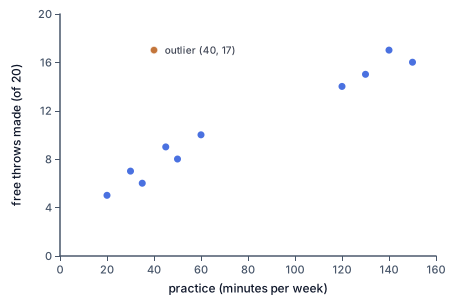
For example, a coach records practice minutes and free throws made for eleven players. The pair $(45, 9)$ means a player practiced $45$ minutes that week and made $9$ of $20$ throws. With practice from $20$ to $150$ minutes, an axis from $0$ to $160$ in steps of $20$ works well.
To judge direction, compare the left side of the cloud with the right side. In the coach's data the players with $20$ to $35$ minutes made $5$ to $7$ throws, and those with $120$ to $150$ minutes made $14$ to $17$. The cloud rises: a positive association.
To judge form, ask whether a single straight line could run through the middle of the cloud with the points scattered evenly on both sides. If yes, the association is linear. If the cloud bends, it is nonlinear. A puppy's weight against its age rises quickly at first and then levels off, so its cloud curves over.
A table shows the same thing without a picture. When the $x$-values go up in equal steps, look at how much $y$ changes each time. Changes that bounce around one size mean linear; changes that grow or shrink steadily mean nonlinear.
The strength of an association is how tightly the points hug the pattern. A narrow band is a strong association; a wide, loose cloud is a weak one.
Look at the coach's scatter plot. The blue dots rise in a band from $5$ throws at $20$ minutes to $16$ at $150$ minutes, so the association is positive and roughly linear. Now look across the bottom axis. The dots sit in two groups, one from $20$ to $60$ minutes and one from $120$ to $150$, with nothing between $60$ and $120$. Those groups are clusters, and the empty stretch is a gap. Here the reason is simple: the younger team practices about an hour a week and the older team more than two hours.
Then find the orange dot at $(40, 17)$. Its neighbors, the players with $35$ and $45$ minutes, made $6$ and $9$ throws, and this player made $17$. It is far above the band that every other dot stays in. That is an outlier.
An outlier is not a mistake to erase. It may be a recording error, but it may be a real player who is simply a natural shooter. Check the data first; if it is right, keep the point and mention it. Clusters and outliers are often the most interesting things in a plot, because they point to something the main pattern does not explain.
A scatter plot can show that two quantities move together. It cannot show why.
Sometimes one really does affect the other: more practice does build skill. But often a third quantity moves both. Across the summer, towns sell more ice cream in the same weeks that more people get sunburned. Ice cream does not cause sunburn; hot, sunny weather raises both. And sometimes the direction runs the other way from what you guessed, or the pattern is a coincidence in a small data set.
So describe a scatter plot with words like associated with and tends to, and save causes for when an experiment has tested it.
An experiment is how scientists separate the two. To test whether practice improves free throws, a coach could split a team at random into two groups, give one group an extra half hour of practice each week and the other none, and compare the groups after a month. Because the groups were chosen at random, nothing but the practice differs between them on average, so a difference in their results can fairly be blamed on the practice.
Why this works. The direction and form describe the pattern most points share; clusters and outliers describe the points that do not share it.
How to check. Cover the outlier with a finger: does the rest of the cloud still show the pattern you named? Swap the axes in your head: the direction should not change. And read your sentence back against two actual dots from the data.
Plot US cities by latitude, how far north they are, against their average yearly temperature. Miami, at about $26^\circ$ north, averages about $77^\circ$F; Atlanta, at about $34^\circ$, about $63^\circ$F; Chicago, at about $42^\circ$, about $51^\circ$F; and Minneapolis, at about $45^\circ$, about $46^\circ$F. The cloud falls: a strong negative association. From Miami to Minneapolis the temperature drops about $31$ degrees over $19$ degrees of latitude, roughly $1.6^\circ$F for each degree north. Cities high in the mountains, such as Leadville, Colorado, come out as outliers far below the band, because altitude also cools the air.
Measure the arm span, fingertip to fingertip, and the height of everyone in a class, and plot the pairs. The dots hug the line $y = x$: a strong, positive, linear association, since for most people the arm span is within a couple of inches of the height. A student $62$ inches tall probably has an arm span between $60$ and $64$ inches. Basketball scouts look for the outliers: a player whose arm span is several inches more than his height sits well above the line, and that extra reach helps block shots and grab rebounds. In a class of $25$, one or two students usually land a few inches off the band, and the plot makes them easy to spot at a glance.
Joining the dots. A scatter plot shows separate individuals; a line through every dot pretends there is a journey.
Expecting every point to follow the trend. An association is a tendency; some points will go the other way.
Deleting an outlier because it is inconvenient. Check it, then keep it and mention it.
Calling a curve linear because it rises. Check whether the changes stay the same size.
Reading association as cause. A third quantity may be moving both.
Read the axes of the coach's scatter plot.
$x: \text{practice (min)}, \quad y: \text{throws made (of 20)}$
Each dot is one player's week.
Compare the players with the least and the most practice.
$(20, 5) \text{ and } (150, 16)$
The dot on the right is much higher than the dot on the left.
Name the direction.
$\text{positive}$
More practice tends to go with more throws made, so the cloud rises.
Check the form against a straight line through the band.
$(30, 7), \; (60, 10), \; (130, 15)$
The dots stay close to one straight band from end to end, without bending.
Describe the association in context.
$\text{positive, roughly linear}$
Players who practice more tend to make more free throws, at a fairly steady rate.
A car's value in thousands of dollars at ages $0$ to $5$ years is $30, 25, 21, 18, 16, 15$. Compare the ends.
$30 \to 15$
Older cars are worth less, so the cloud falls: a negative association.
Find the loss in the first year.
$25 - 30 = -5$
The value dropped $5$ thousand dollars.
Find the loss in the second year.
$21 - 25 = -4$
A smaller drop than the first year.
Find the loss in the last year.
$15 - 16 = -1$
The drops keep shrinking.
Compare the sizes of the drops.
$5 > 4 > 3 > 2 > 1$
Changes that shrink steadily mean the points follow a curve, not a line.
Describe the association in context.
$\text{negative, nonlinear}$
A car loses value fastest when it is new, and more slowly as it ages.
List the practice times of the coach's eleven players in order.
$20, 30, 35, 40, 45, 50, 60, 120, 130, 140, 150$
Clusters and gaps show up along an axis once the values are sorted.
Find the biggest jump between neighbors.
$120 - 60 = 60$
Every other jump is $10$ minutes or less.
Name the clusters and the gap.
$20 \text{ to } 60, \quad 120 \text{ to } 150$
No player practiced between $60$ and $120$ minutes.
Look at the throws made in the first cluster.
$5, 7, 6, 17, 9, 8, 10$
All but one lie between $5$ and $10$.
Find the point that breaks the pattern.
$(40, 17)$
Its neighbors at $35$ and $45$ minutes made $6$ and $9$.
Estimate what the pattern predicts at $40$ minutes.
$\text{about } \dfrac{6 + 9}{2} = 7.5$
Halfway between the neighbors' results is a fair estimate.
Measure how far the point is from the pattern.
$17 - 7.5 = 9.5$
Nine or ten throws above, when every other dot is within two or three of the band.
Decide what to do with the point.
$\text{outlier: check it, keep it, mention it}$
It could be a real sharpshooter, so it is information, not an error to delete.
Compare the ends.
$40 \to 17$
The $y$-values fall as $x$ rises: a negative association.
Find the changes between neighbors.
$-6, \; -5, \; -7, \; -5$
Subtract each $y$ from the next.
Compare the changes.
Describe the association.
A student records the hours she practiced typing each week and her typing speed in words per minute: $\begin{array}{c|cccccc} \text{hours} & 1 & 2 & 3 & 4 & 5 & 6 \\ \hline \text{speed} & 44 & 46 & 53 & 55 & 64 & 67 \end{array}$ Which describes the association on a scatter plot of these points?
Most points in a scatter plot lie close to the line $y = 2x + 8$. Complete the worked solution that checks whether the point $(5, 29)$ is an outlier.
Multiply the point's $x$-value by the slope.
$2 \times 5 =$ p
The pattern's value starts with the slope times $x$.
Add the intercept to get the value the pattern expects.
expected $y =$ q
That is where the line passes at this $x$.
Subtract the expected value from the point's actual $y$.
the point is s above the line
A point far from the line, compared with how close the others sit, is an outlier.
Match each pair of quantities to the association you would expect.
| Positive | Negative | No association | |
|---|---|---|---|
| A person's height and arm span | |||
| Miles driven since filling up and gas left in the tank | |||
| A person's birth month and height |
A family compares each winter month's average temperature with its heating bill: $\begin{array}{c|ccccc} \text{temperature } (^\circ\text{F}) & 20 & 30 & 40 & 50 & 60 \\ \hline \text{bill (dollars)} & 205 & 188 & 179 & 161 & 149 \end{array}$ What is the total change in the bill from $20^\circ$F to $60^\circ$F, and about how much does it change for each $10$ degrees warmer?
Total change t dollars, about r dollars for each $10$ degrees.
A used-car lot plots each car's age in years against its price in thousands of dollars: $\begin{array}{c|cccccccc} \text{age} & 2 & 4 & 5 & 7 & 20 & 22 & 23 & 25 \\ \hline \text{price} & 34 & 32 & 31 & 29 & 17 & 16 & 14 & 13 \end{array}$ The points form two clusters. Between which two ages is the gap?
The gap runs from l years to u years.
A puppy is weighed every two months: $\begin{array}{c|ccccc} \text{age (months)} & 2 & 4 & 6 & 8 & 10 \\ \hline \text{weight (lb)} & 12 & 21 & 28 & 32 & 35 \end{array}$ How much did it gain in the first two months shown and in the last two?
First gain f lb, last gain l lb.
A seaside town records its weekly ice cream sales and its weekly number of swimming accidents for $27$ weeks. The scatter plot rises: weeks with more ice cream sales also have more accidents. What does the plot show?
Lesson test: one question per skill, one attempt each, no hints. Your answers are checked when you submit.
A scatter plot shows six points: $\begin{array}{c|cccccc} x & 6 & 7 & 8 & 9 & 10 & 11 \\ \hline y & 45 & 50 & 55 & 69 & 65 & 70 \end{array}$ Five of them lie on a straight line. Which $x$-value belongs to the outlier, and what $y$-value would fit the line there?
The outlier is at $x =$ x; the line would give $y =$ y.
You can describe a scatter plot's direction, form, clusters and outliers. Without looking: how can you tell from a table whether a rising cloud is linear or curved, and why does an association not prove a cause?
16. Your turn: describe the association in the points $(1, 40)$, $(2, 34)$, $(3, 29)$, $(4, 22)$, $(5, 17)$, step 3
$\text{all about } -6$
They bounce around one size instead of growing or shrinking.
16. Your turn: describe the association in the points $(1, 40)$, $(2, 34)$, $(3, 29)$, $(4, 22)$, $(5, 17)$, step 4
$\text{negative, linear}$
Falling points that stay near one straight line.